Helsinki, Finland
Guggenheim Museum Helsinki
Helsinki, Finland
Our competition design for the Helsinki Guggenheim Museum features loosely arranged spaces and openness that reflect the Finnish mentality. It provides a venue for art while also playing a significant role in the harbour’s rehabilitation.
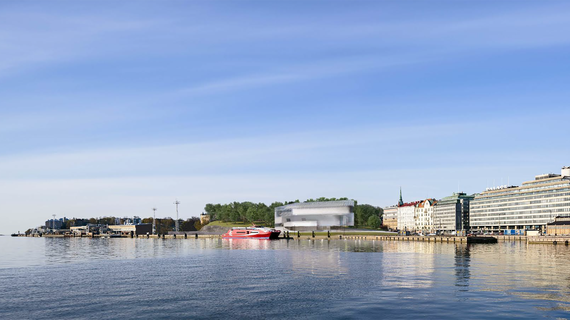
Helsinki’s harbour is the largest in Finland and the second largest among Nordic countries. As the capital’s commercial shipping activities expanded, they were relocated away from the city centre. Today, the South Harbor primarily focuses on passenger transport and tourism, making its rehabilitation a crucial urban development issue. Notably, several of Helsinki’s landmarks are in close proximity, including the Uspenski Cathedral, Senate Square, Market Square, the Old Market Hall, and the Palace Hotel. A new museum on the park side of the gulf, in collaboration with the Museum of Finnish Architecture and the Design Museum, envisioned the creation of a new modern museum district.
Situated at the entrance of the Finnish Gulf, near Saint Petersburg and Tallinn, Helsinki has long been the cultural centre of the region. This was one of the factors that led the Guggenheim Foundation to select Helsinki as the location for their new museum. The Guggenheim Museum network already has iconic buildings in New York, Venice, Bilbao, and Abu Dhabi, each of which has become a true urban landmark, thanks to the work of renowned architects such as Frank Lloyd Wright and Frank Gehry. In 2014, the city of Helsinki and the Guggenheim Foundation jointly launched an international architectural competition to design a 21st-century museum building in the South Harbor. The two-stage competition attracted a total of 1,715 submissions, making it one of the largest architectural competitions in history.
Guggenheim Museum Helsinki
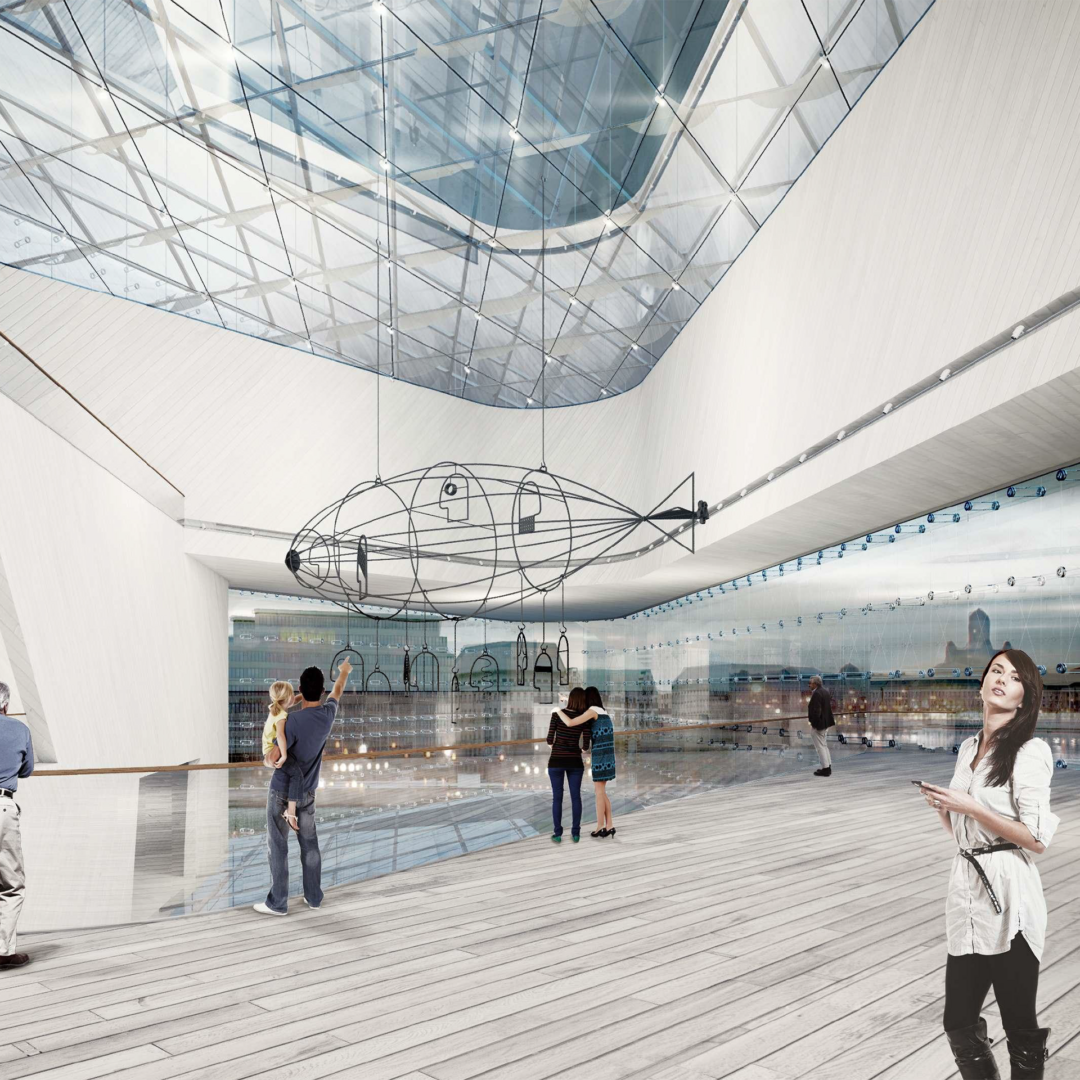
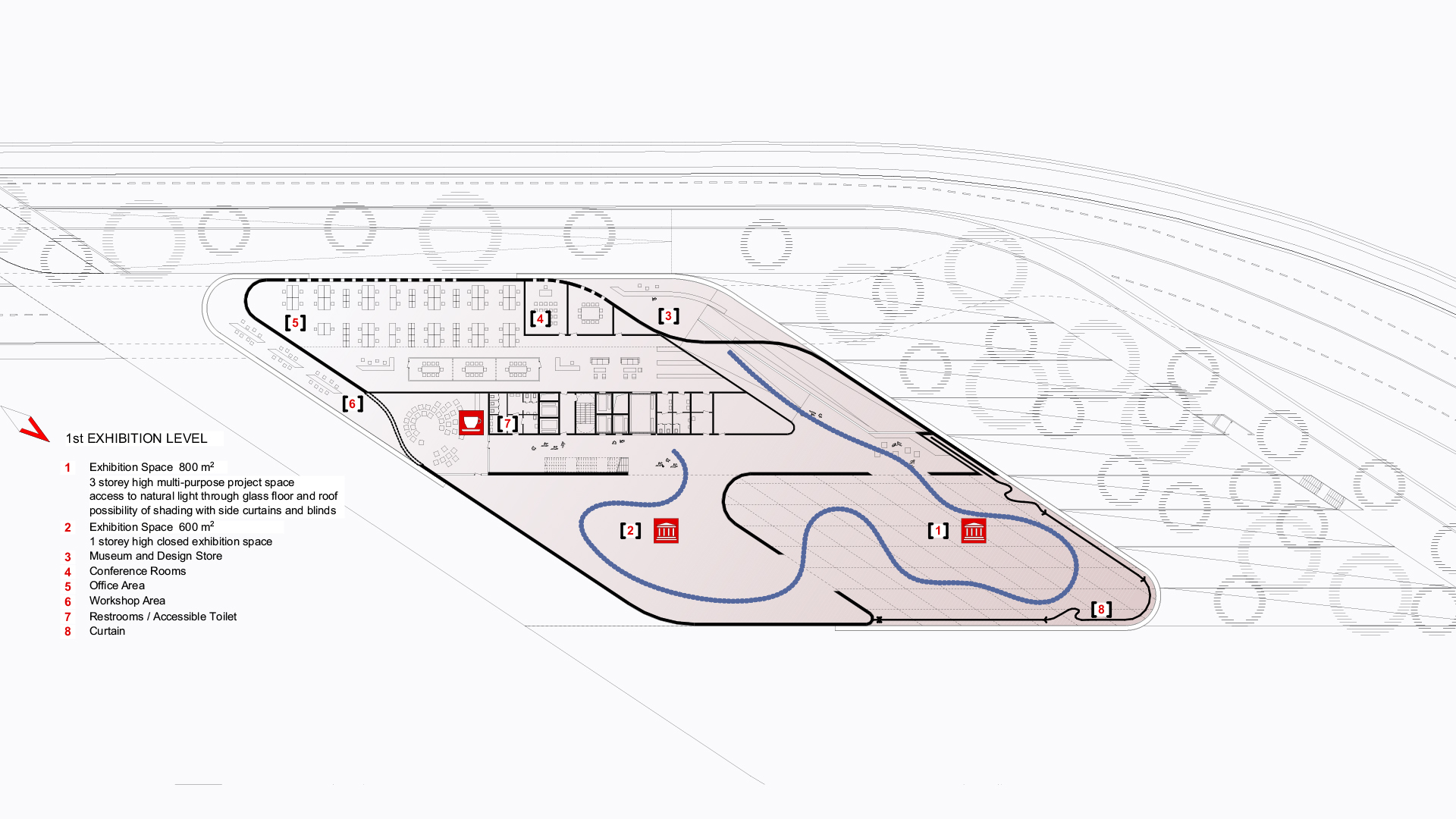
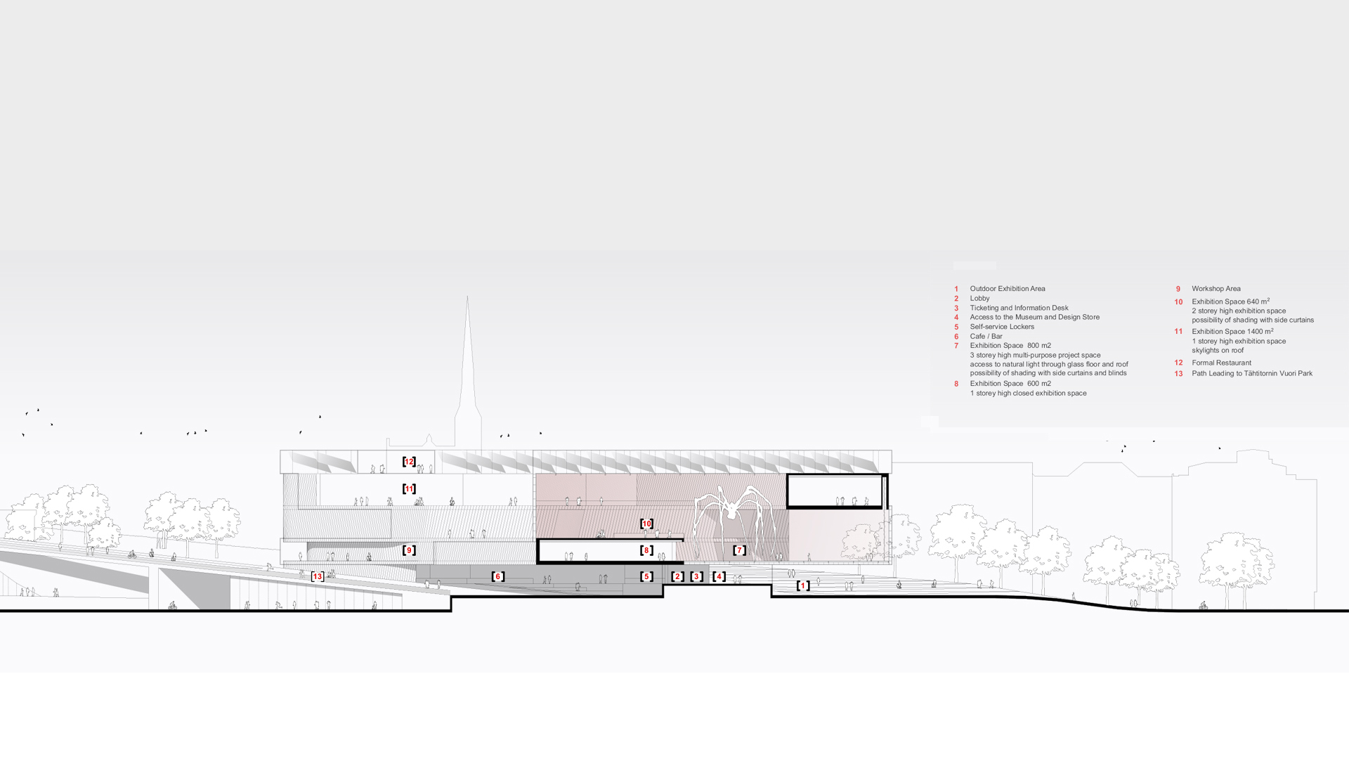
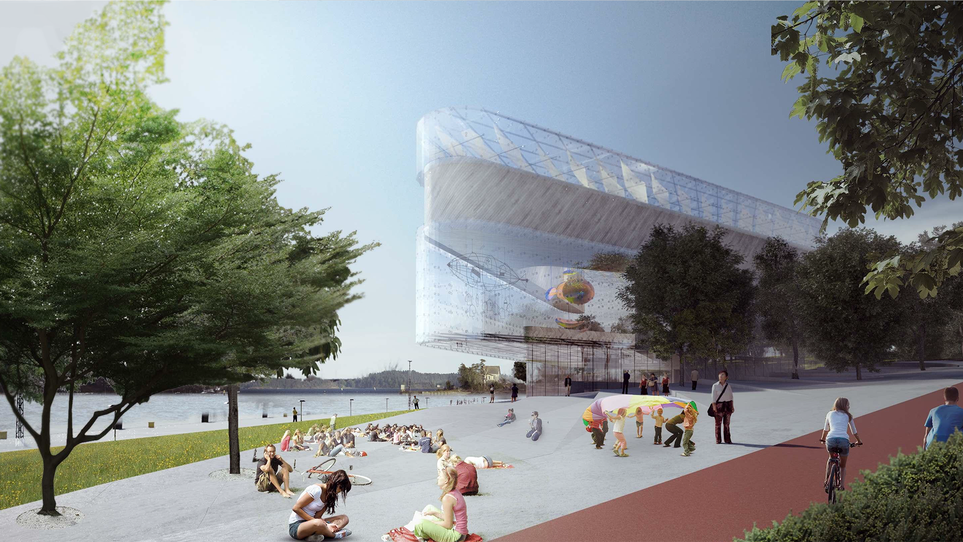
Our design integrates with the historic city grid through its rhombus-shaped layout. The building’s stacked, floating levels seamlessly connect the city centre, the adjacent park, and the industrial harbour. Transparent, open community spaces offer meeting points for both tourists and local art organizations. Approaching from the city centre, visitors can glimpse into the building through the expansive glass surfaces of the exhibition areas. The three-story exhibition hall, which appears to float above the entrance zone, promises a unique spatial experience.

Guggenheim Museum Helsinki
During the long, harsh winters, light becomes essential for vitality. Therefore, our concept features spaces enclosed by glass surfaces that function as lanterns within the gulf.
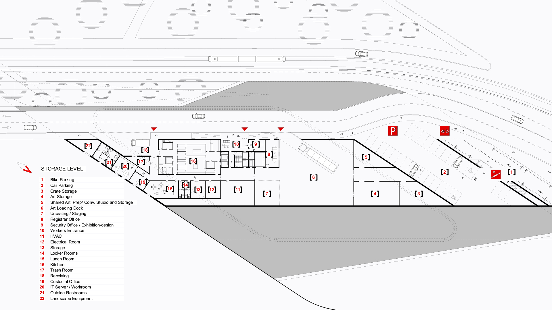
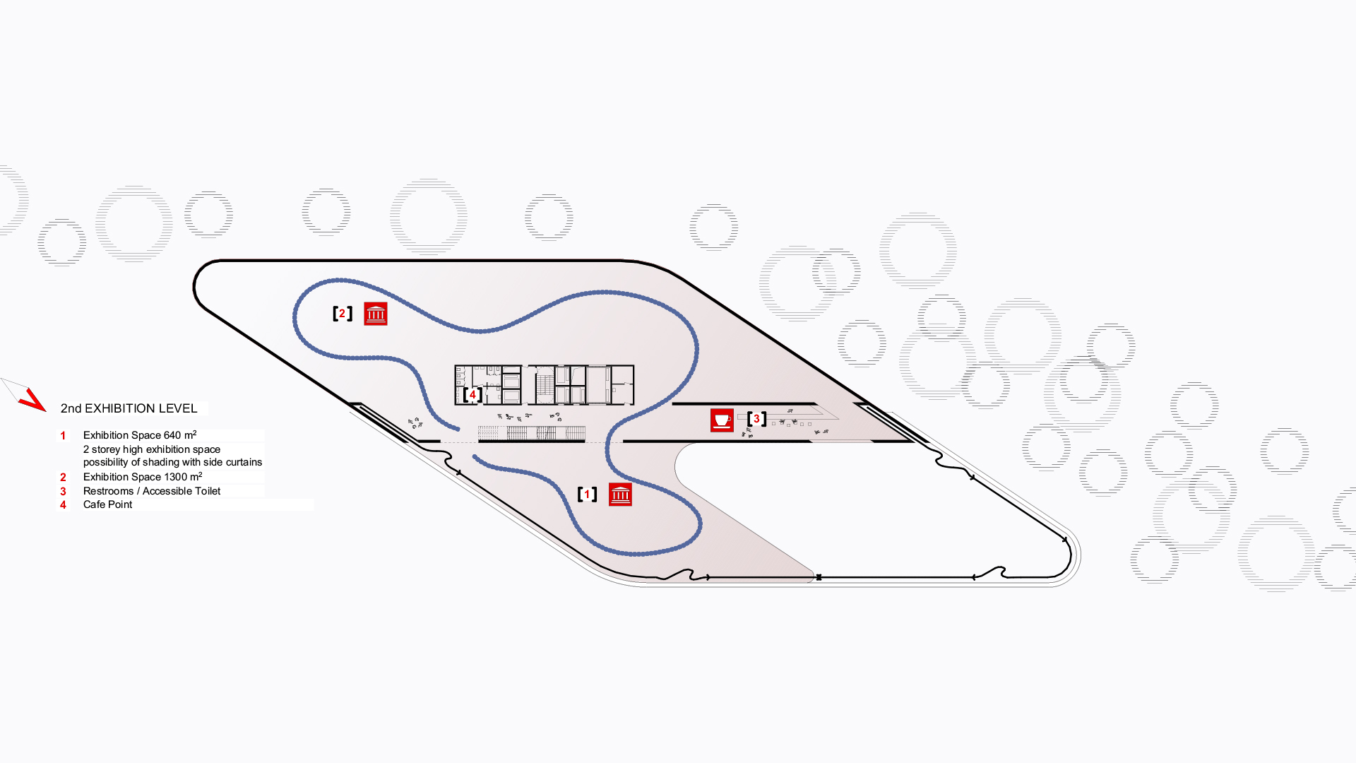
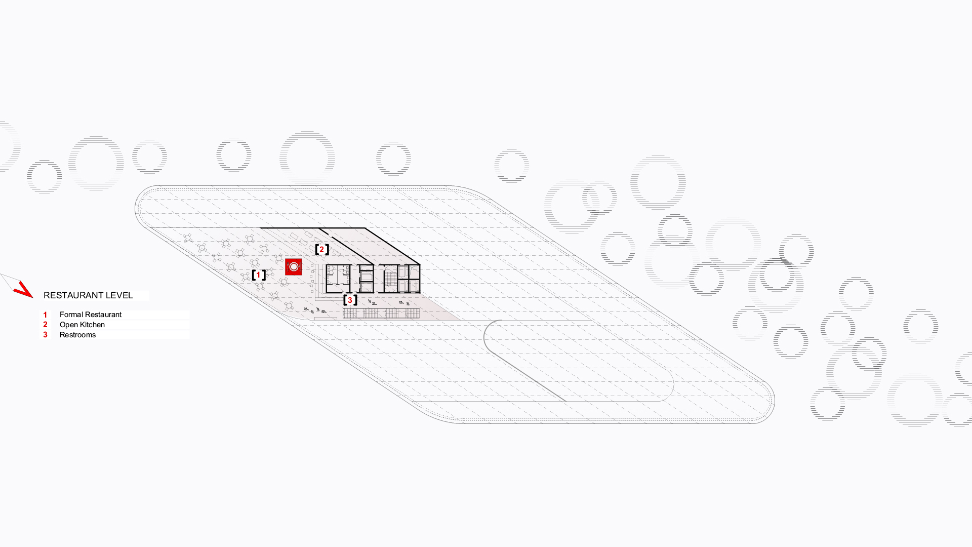
The main arrival level is elevated to the first floor, accessible via a wide ramp from the city centre. Visitors coming from the hilly park area arrive at the same level through a pedestrian passage. The use of natural light and wooden panels in the interiors evokes the atmosphere of the park. The three-story building houses variously sized exhibition spaces that offer flexible usage. The top floor features a sky bar and restaurant, providing panoramic views of the gulf. The building is covered by a double-glazed glass structure with rhombus shape sails in between the layers to provide shade. Operational facilities are located beneath the arrival level, at the harbour level, with direct access to the existing service road.
Project info
Project Name
Guggenheim Helsinki Desigh Competition
Location
Helsinki, Finnland
Dimensions
12 400 m2 (net)
Project Year
2014
Organizer
Malcolm Reading Consultants (MRC)
General Design
BORD Architectural Studio
Head Architect
Peter Bordas
Architect Team
Robert Benke, Gabriella Gaspar, Robert Gulyas, Tamas Mezey, Tamas Tolvaj, Kata Zih
